Thursday, December 7, 2017

17. ANSOFF’S MATRIX

OBJECTIVE

Define the most appropriate business strategy based on the existence of markets and products.


DESCRIPTION

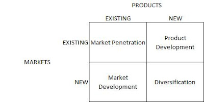
Ansoff’s matrix is usually performed after a SWOT analysis, in which strengths, weaknesses, opportunities, and threats can be transformed into business strategies:

  • -          Market penetration: the organization decides to use existing products in the existing market by improving tactics and strategies to push sales, for example through advertising, promotion, and pricing;
  • -          Product development: the organization decides to develop new products for an existing market or to add new features;
  • -          Market development: the organization decides to sell existing products to new markets, for example exporting to new countries;
  • -          Diversification: the organization decides to take a more radical approach by creating a new product for a new market. This can be the result of an opportunity caused by a new trend, identified in the SWOT analysis.


Ansoff's matrix

Figure 14: Ansoff’s Matix


Once the strategy has been defined using Ansoff’s matrix, the objectives, strategies, and tactics can be revised in the VMOST model. The information needed for this matrix can usually be found in previous internal analysis, external analysis, and SWOT analysis.


TEMPLATE


Sunday, October 29, 2017

63. PRINCIPAL COMPONENT ANALYSIS

OBJECTIVE

Analyze the interrelations among several variables and explain them with a reduced number of variables.


DESCRIPTION
A principal component analysis (PCA) analyzes the interrelations among a large number of variables to find a small number of variables (components) that explain the variance of the original variables. This method is usually performed as the first step in a series of analyses; for example, it can be used when there are too many predictor variables compared with the number of observations or to avoid multicollinearity.

Suppose that a company is obtaining responses about many characteristics of a product, say a new shampoo: color, smell, cleanliness, and shine. After a PCA it finds out that the four original variables can be reduced to two components[1]:
  • -          Component “quality”: color and smell;
  • -          Component “effect on hair”: cleanliness and shine.

Even though it is possible to run a PCA in Excel with complex calculations or special complements,[2] I suggest using a proper statistical tool. Here I will only explain some guidelines when performing a PCA.

First of all, the analysis starts with a covariance or correlation matrix. I suggest using a correlation matrix, since we cannot use a covariance matrix if the variables have different scales or the variances are too different. Then, eigenvectors (the direction of the variance) and eigenvalues (the degree of variance in a certain direction) are calculated. Now we have a number of components that is equal to the number of variables, each one with a specific eigenvalue.

Results of Principal Component Analysis
Figure 74: Results of a PCA

The more variance (eigenvalue) that a component explains, the more important it is. There are several approaches that we can use to choose the number of components to retain:
-          Defining a threshold before the analysis:

  •   choose all the components with a certain eigenvalue (usually > 1);
  •    choose a priori a specific number of components (then verify the total variance       explained and other validity tests);
  •    choose the first x components that explain at least X% of the variance, for example      80% if using the results for descriptive purposes or higher if the results will be used      in other statistical analysis (Figure 74);

-          Use a scree plot (Figure 75) and “cut” the line at the main inflexion point or at one of the main inflexion points where there is an acceptable total variance explained (for example, in Figure 75 the first four components can be chosen, since there is an important inflexion point, but they just explain 60% of the variance).

Scree Plot Principal Component Analysis

 Figure 75: Scree Plot

The next step is to analyze the principal components’ correlation coefficients in a matrix with variables and components. Ideally we want one variable to have a high correlation with one component to define each component conceptually (smell and color = component “quality”). However, even if we cannot explain the resulting components conceptually, we have to bear in mind that the main objective of a PCA is to reduce a large number of variables to a manageable number of components, while interpreting the component is not strictly necessary. In chapter 64. EXPLORATORY FACTOR ANALYSIS, PCA analysis will be used as the method for a factor analysis, and I will introduce optimization methods, factor scoring, and validity tests.


TEMPLATE


[1] In spite of this example, PCA is usually performed when we have a larger number of variables.

Thursday, September 7, 2017

22. MONADIC PRICE TESTING

OBJECTIVE

Analyze people’s purchase intention at different price points and for alternative products.


DESCRIPTION

In monadic price testing, purchase behavior is tested for several price points, but each respondent is shown just a single price. Due to this method, a large base of respondents is necessary. A variation that needs a smaller sample is sequential monadic testing, in which the respondents are shown different price points, one at a time (usually no more than three price points are presented to each respondent). It is important to bear in mind that sequential monadic testing implies some biases and usually shows a higher purchase intention at the lower prices than monadic testing.

This is probably the best method for analyzing purchase behavior at a given price; however, it is only useful if we have an idea of the appropriate price points for a particular market. If this is not the case, we would need to obtain this information prior to the analysis, either through direct or indirect survey methods (see 18.INTRODUCTION).


Monadic price testing excel template

Figure 20: Demand Curve Derived from Monadic Price Testing

Once the data have been collected, we can summarize the purchase behavior for the different price points (e.g. 11% of the market would purchase the product at €30, €32% at 20, etc.), and we can estimate a demand curve. The data are usually collected through surveys but can also be obtained from controlled experiments.


TEMPLATE


Tuesday, August 22, 2017

43. t-TEST

OBJECTIVE

Verify whether two groups are significantly different.


DESCRIPTION

There are three main applications of the t-test:
  • -          One-sample t-test: compare a sample mean with the mean of its population;
  • -          Two-sample t-test: compare two sample means;
  • -          Paired t-test: compare two means of the same sample in different situations (i.e. before and after a treatment).[1]

To perform a t-test, it is necessary to check the normality assumption (see 36.INTRODUCTION TO REGRESSIONS); however, the t-test tolerates deviations from normality as long as the sample size is large and the two samples have a similar number of elements. In the case of important normality deviations, we can either transform the data or use a non-parametric test (see Figure 40 in chapter 41.INTRODUCTION TO HYPOTHESIS TESTING).

An alternative to the t-test is the z-test; however, besides the normality assumption, it needs a larger sample size (usually > 30) and the standard deviation of the population.
Each of the three kinds of t-tests described above has two variations depending on the kind of hypothesis to be tested. If the alternative hypothesis is that the two means are different, then a two-tailed test is necessary. If the hypothesis is that one mean is higher or lower than the other one, then a one-tailed test is required. It is also possible to specify in the hypothesis that the difference will be larger than a certain number (in two-sample and paired t-tests).

After performing the test, we can reject the null hypothesis (there are no differences) if the p-value is lower than the alpha (α) chosen (usually 0.05) and if the t-stat value is not between the negative and the positive t-critical value (see the template). The critical value of t for a two-tailed test (t-critical two-tail) is used to calculate the confidence interval that will be at the 1 minus the α chosen (if we choose 0.05 we will have a 95% confidence interval).


ONE-SAMPLE T-TEST

With this test we compare a sample mean with the mean of the population. For example, we have a shampoo factory and we know that each bottle has to be filled with 300 ml of shampoo. To control the quality of the final product, we take random samples from the production line and measure the amount of shampoo.

One-Sample t-Test


Figure 43: Input Data of a One-Sample t-Test

Since we want to stop and fix the production line if the amount of shampoo is smaller or larger than the expected quantity (300 ml), we have to run a two-tailed test. Figure 43 shows the input data as well as the calculated standard deviation and sample mean, which is 295. A confidence level of 0.05 is chosen. We then calculate the t-critical value and p-value (the formulas can be checked in the template).

One-Sample t-Test

Figure 44: Results of a One-Sample t-Test

Since the p-value is lower than the alpha (0.05), we conclude that the difference in the means is significant and that we should fix our production line. The results also include the confidence interval of 95%, which means that we are 95% confident that the bottles are filled with a minimum of 292 ml and a maximum of 298 ml.


TWO-SAMPLE T-TEST

A practical example would be to determine whether male clients buy more or less than female ones.
First of all, we should define our hypothesis. In our example our hypothesis is that male and female clients do not buy the same amount of goods, so we should use a two-tailed test; that is, we do not infer that one group buys more than the other one. On the other hand, if we would like to test whether males buy more, in this case we would use a one-tailed test.
In the Excel complement “Data Analysis,” we choose the option “t-Test: Two-Sample Assuming Unequal Variances” by default, since, even if the variances are equal, the results will not be different, but if we assume equal variances, than we will have a problem in the results if finally the variances are not equal. We select the two-sample data and specify our confidence level (alpha, by default 0.05).

Two-Sample t-test Assuming Unequal Variances

Figure 45: Output of a Two-Sample t-test Assuming Unequal Variances

Since we are testing the difference, either positive or negative, in the output, we have to use the two-tailed p-value and two-tailed t-critical value. In this example the difference is significant, since the p-value is smaller than the chosen alpha (0.05).
Confidence intervals are also calculated in the template, concluding that we are 95% confident that women buy between 8 and 37 more products than men.


PAIRED T-TEST

We want to test two different products on several potential consumers to decide which one is better by asking participants to try each one and rate them on a scale from 1 to 10. Since we have decided to use the same group to test both products, we are going to run a paired two-tailed t-test. The alpha chosen is 0.05.

Paired t-Test

Figure 46: Output of a Paired t-Test

The results of the example show that there is no significant difference in the rating of the two products, since the p-value (two-tail) is larger than the alpha (0.05). The template  also contains the confidence interval of the mean difference, which in this case includes 0 since there is no significant difference.


TEMPLATE


[1] In some cases it is also possible to use two samples and match each component on a certain dimension.

Tuesday, August 8, 2017

70. TIME SERIES ANALYSIS

OBJECTIVE

Forecast the demand for the next periods.


DESCRIPTION

Time series analysis is useful for forecasting based on the patterns underlying the past data. There are four main components:

  • - Trend: a long-term movement concerning time series that can be upward, downward, or stationary (an example can be the upward trend in population growth);
  • -  Cyclical: a pattern that is usually observed over two or more years, and it is caused by circumstances that repeat in cycles (for example economic cycles, which present four phases: prosperity, decline, depression, and recovery);
  • -     Seasonal: variations within a year that usually depend on the weather, customers’ habits, and so on;
  • - Irregular components: random events with unpredictable influences on the time series.
Time Series Analysis


Time Series Analysis


There are two main types of models depending on how the previous four components are included:

(     1)    Y(t)=T(t) x S(t) x C(t) x I(t)
Multiplicative models: the four components are multiplied, and in this case we assume that the components can affect each other.

(     2)    Y(t)=T(t) + S(t) + C(t) + I(t)
Additive models: we make the assumption that the components are independent.


Another important element of time series is stationarity. A process is stationary when an event is influenced by a previous event or events. For example, if today the temperature is quite high, it is more likely that tomorrow it will be quite high as well.

There are many models for time series analysis, but one of the most used is ARIMA (autoregressive integrated moving average). There are some variations of it as well as non-linear models. However, linear models such as ARIMA are widely used due to their simplicity of implementation and understanding.

A good time series analysis implies several exploratory analyses and model validation, which requires statistical knowledge and experience. The template contains a simplification of a time series model in which seasonality and trends are isolated to forecast future sales.
The data can be collected at every instance of time (continuous time series), for example temperature reading, or at discrete points of time (discrete time series), when they are observed daily, weekly, monthly, and so on.


TEMPLATE


Monday, July 10, 2017

12. PRODUCT LIFE CYCLE ANALYSIS

OBJECTIVE

Define the maturity of the industry in which a company is competing or the maturity of a product that it is selling.


DESCRIPTION

Several studies have been carried out on industries’ life cycles. Industries and products usually start from an emergent phase, pass through a growth phase, and finally reach a mature phase. At this point either they start the cycle again thanks to innovations or they decline.

This is a tool made for reasoning about the maturity of the industry and the maturity of the kind of products being manufactured. To define the phase in which the company is positioned, consider the following:

  • -          Emergent phase: this is characterized by a small number of firms, low revenues, and usually zero or negative margins;
  • -          Growth phase: the margins are increasing rapidly (for a while, but less in the last part of the growth phase), as well as the number of firms;
  • -          Mature phase: the global revenues are increasing at a far slower rate; both the margins and the number of firms are decreasing.


Phases Product Life Cycle

Competitive Life Cycle


Usually, after the emergent phase, the dominant standards are defined and the rise of one or a few companies is experienced (annealing). Due to rapidly increasing margins, many companies imitate those successful pioneers, and, consequently, the margins start to decrease and a few companies start to leave the market (shakeout). Only the most efficient firms remain in the market during the mature phase, at the end of which we have either decline or disruption thanks to innovation or a demand shift. Finally, the process starts again.


TEMPLATE


Thursday, May 18, 2017

21. VAN WESTENDORP PRICE SENSITIVITY METER

OBJECTIVE

Determine consumer price preferences.


DESCRIPTION

People are asked to define prices for a product at four levels: too cheap, cheap, expensive, and too expensive. The questions usually asked are:

  • -     At what price would you consider the product to be so expensive that you would not buy it? (Too expensive)
  • -    At what price would you consider the product to be so inexpensive that you would doubt its quality? (Too cheap)
  • -       At what price would you consider the product to start to be expensive enough that you could start to reconsider buying it? (Expensive)
  • -       At what price would you consider the product to be good value for money? (Cheap)


The results are organized by price level, with the accumulated demand for each question. The demand is usually accumulated inversely for the categories “cheap” and “too cheap” to define crossing points with the other two variables (Figure below).


Van Westendorp Price Sensitivity Meter


Van Westendorp’s Price Sensitivity Meter

From the four intersections, we have the boundaries between which the price should be settled (lower bound and upper bound). Although the other two price points are sometimes used, I prefer to use this model to define the lead prices and upper prices for a product, while the middle prices should not be static but should change based on several factors (period of purchase, place, conditions, etc.).

With this model we can define price boundaries, but we cannot estimate the purchase likelihood or demand. For the estimation of the demand (and revenues), we ask an additional question regarding the likelihood of buying the product at a specific price with a five-point Likert scale (5 = strongly agree, 1 = strongly disagree). The price to be tested can be the average of the “cheap” price and the “expensive” price for each respondent. A more comprehensive approach would be to ask the question for both the “cheap” and the “expensive” price. Then the results must be transformed into purchase probabilities, for example strongly agree = 70%, agree = 50%, and so on. With these results we can build a cumulative demand curve and a revenue curve (Figure below). The optimal price is the one at which the revenues are maximized (be aware that this approach aims to maximize revenues and does not take into account any variable costs).

Van Westendorp demand and revenue estimation


Van Westendorp’s PMS Extension with Demand and Revenue Estimation


TEMPLATE

Discount code -40%BLOG_ANALYTICS_MODELS

Tuesday, April 25, 2017

37. PEARSON CORRELATION

OBJECTIVE

Find out which quantitative variables are related to each other and define the degree of correlation between pairs of variables.


DESCRIPTION

This method estimates the Pearson correlation coefficient, which quantifies the strength and direction of the linear association of two variables. It is useful when we have several variables that may be correlated with each other and we want to select the ones with the strongest relationship. Correlation can be performed to choose the variables for a predictive linear regression.

Pearson Correlation

Correlation Matrix

With the Excel Data Analysis complement, we can perform a correlation analysis resulting in a double-entry table with correlation coefficients (Pearson’s coefficients). We can also calculate correlations using the Excel formula “=CORREL().” The sign of the coefficient (Pearson correlation coefficient) represents the direction (if x increases then y increases = positive correlation; if x increases then y decreases = negative correlation), while the absolute value from 0 to 1 represents the strength of the correlation. Usually above 0.8 it is very strong, from 0.6 to 0.8 it is strong, and when it is lower than 0.4 there is no correlation (or it is very weak).

The figure above shows that there is a very strong positive correlation between X1 and Y and a strong positive correlation between X1–X3 and X3–Y. X3 and X4 have a weak negative correlation.


TEMPLATE


Wednesday, April 12, 2017

36. INTRODUCTION TO REGRESSIONS

Regressions are parametric models that predict a quantitative outcome (dependent variable) from one or more quantitative predictor variables (independent variable). The model to be applied depends on the kind of relationship that the variables exhibit. 

Regressions take the form of equations in which “y” is the response variables that represent the outcome and “x” is the input variable, that is to say the explanatory variable. Before undertaking the analysis, it is important that several conditions are met:
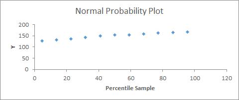
  • -          Y values must have a normal distribution: this can be analyzed with a standardized residual plot, in which most of the values should be close to 0 (in samples larger than 50, this is less important), or a probability residual plot, in which there should be an approximate straight line (Figure 31);
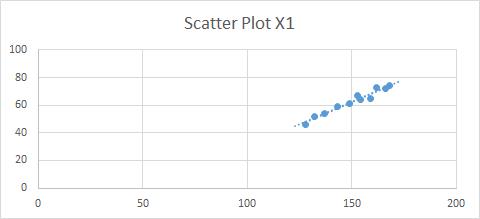
  • -          Y values must have a similar variance around each x value: we can use a best-fit line in a scatter plot (Figure 32);
  • -          Residuals must be independent; specifically, in the residual plot (Figure 33), the points must be equally distributed around the 0 line and not show any pattern (randomly distributed).


Normal probability plot

Figure 31: Normal Probability Plot

Best-Fit Line Scatter Plot

Figure 32: Best-Fit Line Scatter Plot

If the conditions are not met, we can either transform the variables[1] or perform a non-parametric analysis (see 47. INTRODUCTION TO NON-PARAMETRIC MODELS).

In addition, regressions are sensitive to outliers, so it is important to deal with them properly. We can detect outliers using a standardized residual plot, in which data that fall outside +3 and -3 (standard deviations) are usually considered to be outliers. In this case we should first check whether it was a mistake in collecting the data (for example a 200-year-old person is a mistake) and eliminate the outlier from the data set or replace it (see below how to deal with missing data). If it is not a mistake, a common practice is to carry out the regression with and without the outliers and present both results or to transform the data. For example, we may apply a log transformation or a rank transformation. In any case we should be aware of the implications of these transformations.

Standardized Residuals Plot with an Outlier

Figure 33: Standardized Residuals Plot with an Outlier

Another problem with regressions is that records with missing data are excluded from the analysis. First of all we should understand the meaning of a missing piece of information: does it mean 0 or does it mean that the interviewee preferred not to respond? In the second case, if it is important to include this information, we can substitute the missing data with a value:
  • -          With central tendency measures, if we think that the responses have a normal distribution, meaning that there is no specific reason for not responding to this question, we can use the mean or median of the existing data;
  • -          Predict the missing values using other variables; for example, if we have some missing data for the variable “income,” maybe we can use age and profession to for the prediction.

Check the linear regression template (see 38. LINEAR REGRESSION), which provides an example of how to generate the standardized residuals plot.


[1] To improve normality and variance conditions, we can try applying a log transformation to the response (dependent) variable. We can also use other types of transformations, but we must remember that the interpretation of the results is more complex when we transform our variables.